Brief
Overview
Overview
Rasgo’s founders, Jared and Patrick, were looking for ways to handle the complex, highly inefficient process of transforming raw data into training-ready features. Their passion for data science and machine learning and how these could transform the world of business paved the way for Rasgo.
The team at Rasgo approached Seattle New Media to help resolve some of their website’s problems; from handling a complex resource page with lots of categories, redesigning their home and product pages, and ultimately a full restructure of the website. Akhil K Joseph on our team led this project to a very successful completion.
Services provided
Webflow implementation
UI/UX in Figma
High-fidelity designs
Third-party integration
SEO consultation
During our work with IOS List, we embarked on a creative journey to reshape its online presence. We enhanced the website using Webflow, incorporated automation with Airtable, and ensured secure transactions with Stripe. User Experience Optimization refined every detail for seamless navigation. Integration of Google Maps API added interactive property exploration. Our efforts aimed not just at creating a website, but at building a portal for the future of IOS exploration.
Technologies used
.png)
.png)
Challenges
Rasgo’s previous website was initially designed by a different agency. However, the site had a lot of vexing pain points. During our discussions with Rasgo, the team emphasized that most user acquisitions happened via their resources page. But yet many white papers, cases studies, and other content/pages were not getting traffic. There was too much complexity with too many irrelevant categories.
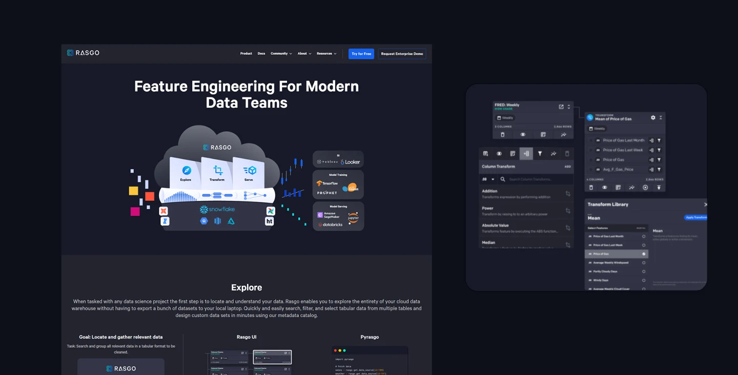
Also their home and product pages were not optimally designed to explain what they offer to their niche target audience. It was not clear on the homepage and product pages what exactly their product was to be used for. And the product pages were also disorganized and lacking diagrammatic representations of their offerings.


Our approach
Solution
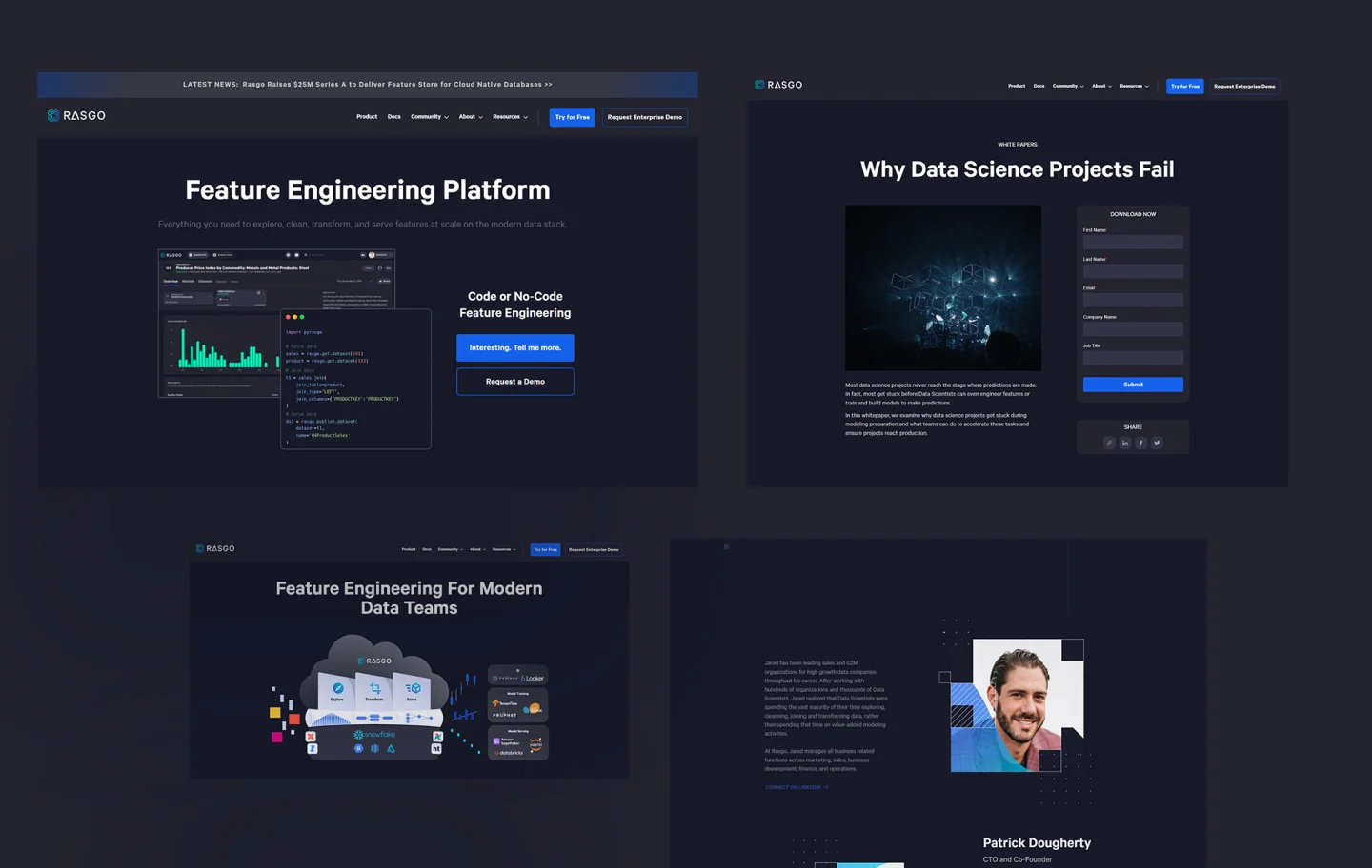
When we started working on this project, the client wanted to create a better user experience on their resource page, as a phase one. They wanted that page to be modern, searchable, elegant and functional with filtering options. So, we implemented enhanced search functionality using custom JavaScript along with new filtering options using Jetboost, ensuring that users could easily navigate to different areas of the resource content.
As an add-on, second-phase approach, we redesigned and reworked the website’s home and product pages. We strategized on how to improve their website’s features and performance, and decided upon changing its internal content pages, based on monitoring the heatmaps and user drop-off points in Google Analytics.
As a phase three, we removed all low-traffic and low-performing pages and redesigned the entire website with better navigation and improved user experience by focusing on pages which were facing user acquisition issues. After doing A/B testing on various pages we decided to restructure the website with a simple navigation and better user experience. We also worked on page loading speeds.
Implementation
.png)
Custom designed Illustrations
Site redesign to offer an enriching user experience
Rasgo’s goal as a company is to amplify the impact of data science by enabling end users to explore, clean, join, and transform data into highly curated machine learning features. Seattle New Media enjoyed working with their team to reimagine Rasgo’s dream by redesigning its website and greatly enhancing their site’s user experience. We used a phased approach for each set of milestones. In the end, they saw a drastic increase in new organic traffic, page load speed increases, and prospect conversions. Jared and Patrick loved the work that we did for them on this project.
Key Takeaways
Aesthetics,
convenience,
...and sales


.png)
.png)
.png)
.png)


.webp)

.png)
.png)


